Case Study
Improving Quiz Engagement & RPS Using an Opportunity Solution Tree
Overview
Describing The Product
In 2020, I led the redesign of a high-traffic trivia quiz platform that monetized through mobile display ads.
Our goal: reimagine the UI to improve quiz completion rates, increase ad viewability, and lift revenue per session—without sacrificing user experience. This initiative became known as Q&A 2.0.
My Role
As the sole PM on this initiative, I:
Aligned product vision with monetization and UX goals
Collaborated daily with engineers, designers, and analysts
Defined the Opportunity Solution Tree structure and experimentation roadmap
Presented learnings to execs and influenced future monetization strategy
Defining The Problem
Problem Statement
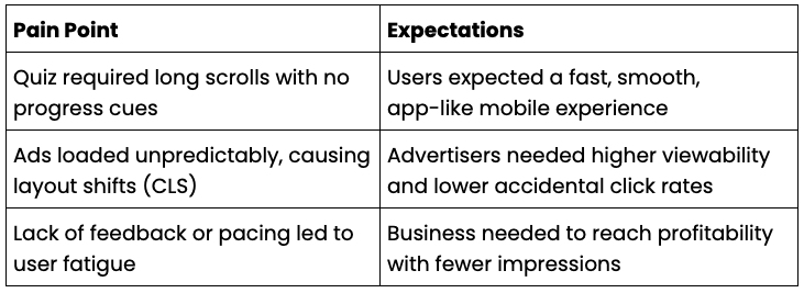
Our original quiz flow was overly long, ad-heavy, and caused high user drop-off. Ads often triggered layout shifts and policy violations. Performance was slow on lower-end mobile devices.
Why This Problem
We relied heavily on users completing long sessions and viewing multiple ads to break even. Poor UX reduced completion and ad quality. Policy penalties further suppressed revenue.
Impact
User Experience: Long, frustrating sessions with poor mobile performance
Ad Viewability %: Low due to scroll-based layout and page reflow
Quiz Completion Rate & Break Even Point: Users needed to answer 30 questions to reach profitability. Few did.
Identifying & Prioritizing Pain Points
Prioritization of Pain Points
CLS and accidental clicks (policy violations)
High quiz drop-off before monetizable milestones
Low eCPM from oversaturated ad layout
Poor engagement due to lack of pacing and feedback
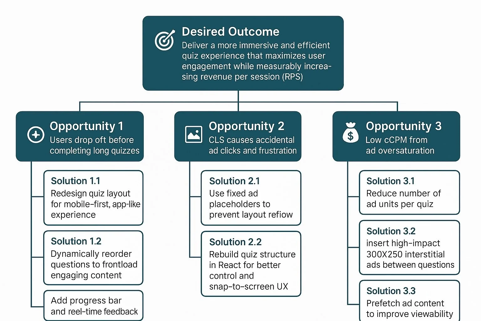
Framework: Opportunity Solution Tree
We used the Opportunity Solution Tree to map our goals, opportunities, and targeted solutions.
🎯 Desired Outcome: Deliver a more immersive and efficient quiz experience that maximizes user engagement while measurably increasing revenue per session (RPS)
Solutions
Explanation of Prioritized Solutions
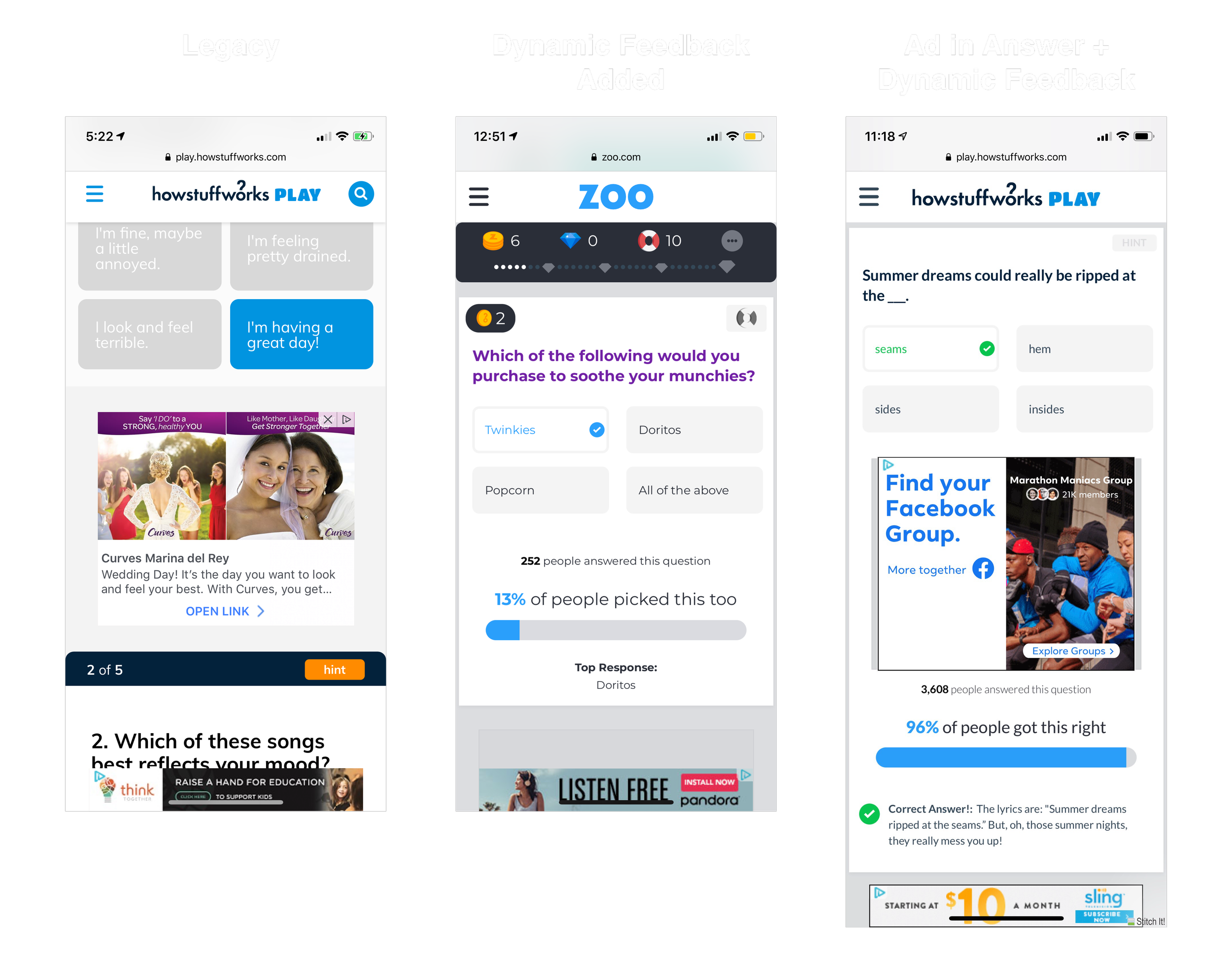
1. Rebuilt the Quiz UX for an App-Like Feel
Used React to implement vertical snap transitions
Fixed-height cards with tap-to-advance progression
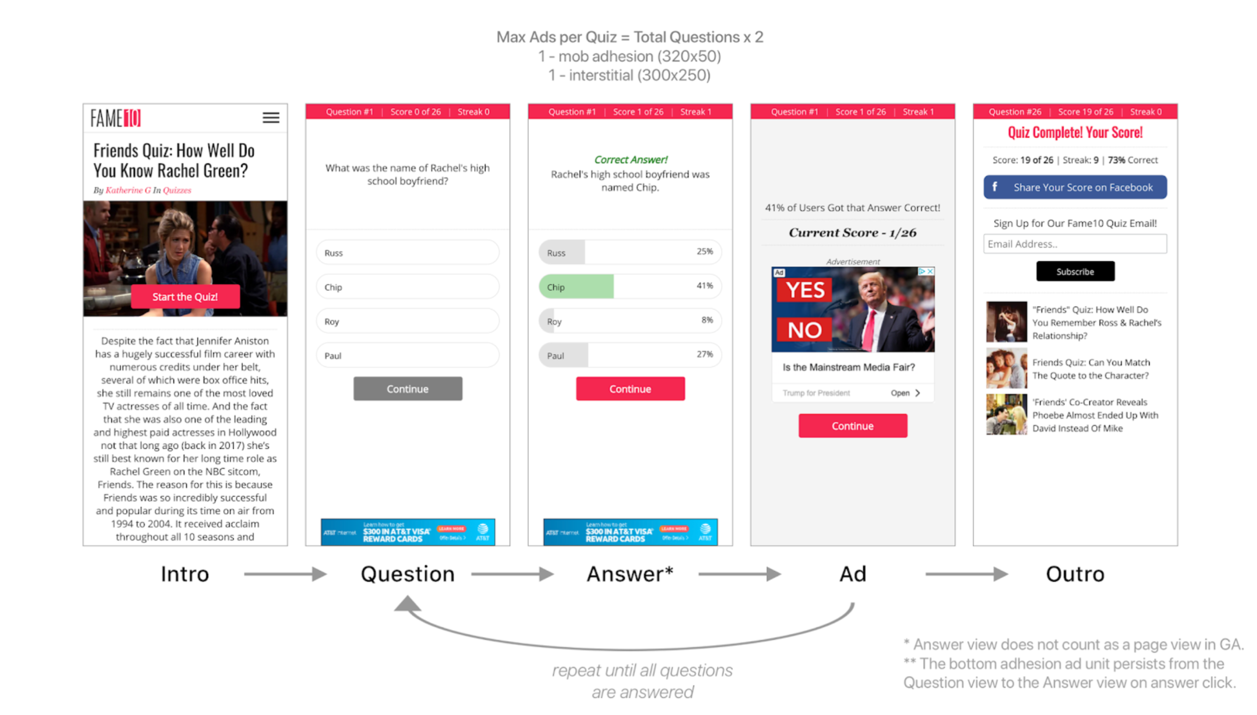
2. Introduced Interstitial Feedback Screens
Introduced a new ad unit per quiz question
Delivered real-time performance feedback + social proof
Prefetched 300x250 ad units to improve ad viewability
3. Reduced CLS and Improved Performance
Inserted ad placeholders to prevent layout shift
Reduced ad calls per page, improving load times and policy compliance
Pitfalls & Mitigations
1. Risk: Reduced Ad Impressions Could Hurt Revenue
Mitigation: A/B tested reduced ad density and confirmed eCPM increase
2. Risk: User Confusion from New Flow
Mitigation: Applied familiar navigation patterns, tested copy for clarity
3. Risk: New Layouts Could Introduce CLS or Violations
Mitigation: Used placeholders, followed IAB best practices, audited performance
4. Risk: Technical Debt or Performance Regression
Mitigation: Modular React components, async loading, strict performance budget

Results
It all begins with an idea. Maybe you want to launch a business. Maybe you want to turn a hobby into something more. Or maybe you have a creative project to share with the world.
Key Insights
Fewer, better-placed ads led to higher eCPM and improved user experience
The original layout had crossed the diminishing returns threshold for ads
Small, intentional UI changes can unlock massive gains across monetization and engagement